When it comes to cannabis retail, a dispensary’s menu is one of its most valuable tools for driving sales, educating customers, and reinforcing brand identity. As more states legalize marijuana and competition increases, how dispensaries present their products matters more than ever. Two common strategies dominate the space: minimalist menus and informational menus. Each has strengths, weaknesses, and ideal use cases. So, which one delivers the best results?
Minimalist Menus: Less Is More
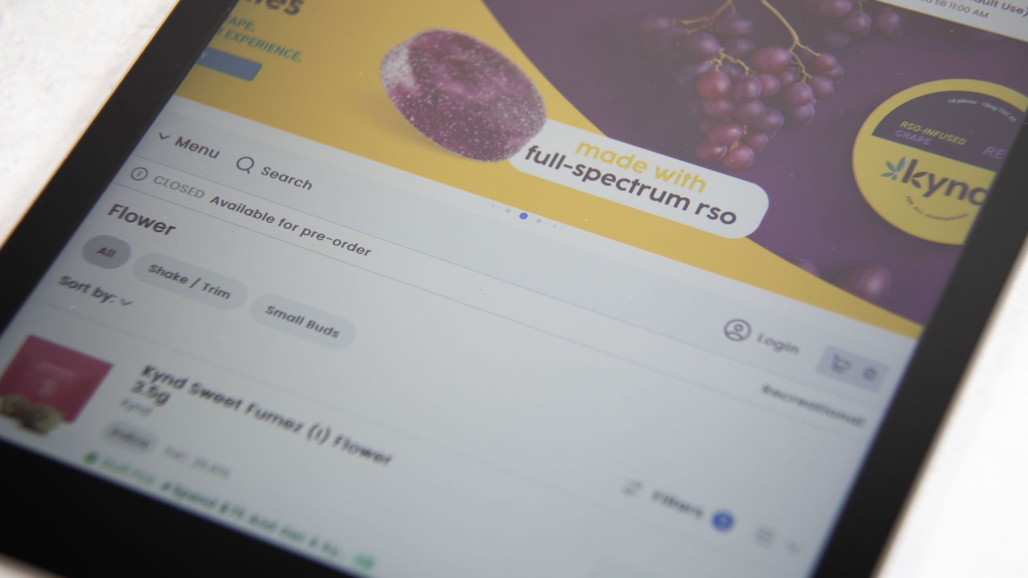
Minimalist menu layouts are designed with simplicity in mind. These menus strip away excess clutter and focus on high-level product organization, clean typography, intuitive navigation, and sleek visuals. They prioritize user experience over technical detail and are particularly popular in upscale or lifestyle-oriented dispensaries.
Minimalist menus work well for:
- First-time or casual customers who may feel overwhelmed by cannabis jargon or scientific data.
- Touchscreen kiosks and mobile interfaces where limited space calls for concise layouts.
- Retailers emphasizing design and ambiance, often as part of a broader luxury branding strategy.
These menus typically categorize products broadly—such as “Indica Flower,” “Sativa Vape Pens,” or “Gummies”—with just enough information to help users browse easily. The simplicity reduces cognitive load, speeds up decision-making, and allows for a more relaxed shopping experience.
That said, minimalist menus can leave information-hungry consumers wanting more. If a medical patient or experienced user wants to know terpene profiles, cannabinoid percentages, or cultivation methods, they may have to ask a budtender or search for external resources. This can slow down the process or lead to missed opportunities for upselling.
Informational Menus: Knowledge is Power
Informational menus take a different approach. These layouts are dense with details, offering strain names, lab results, THC/CBD percentages, terpene charts, product effects, brand stories, and even user reviews. For customers who know what they’re looking for—or want to explore the science behind cannabis—these menus offer valuable transparency.
Informational menus are ideal for:
- Medical dispensaries where patients need thorough details to guide therapeutic choices.
- Experienced or daily users who shop based on specific cannabinoids, effects, or brands.
- Online platforms and digital kiosks with robust filtering, sorting, and search capabilities.
This approach empowers customers to make informed decisions and often builds credibility and trust. It also enables greater personalization—shoppers can filter products by need (e.g., sleep, energy, pain relief), price, or flavor profile.
However, if not well organized, informational menus can overwhelm newer customers. A wall of data can be intimidating, especially if there’s no context or education. Additionally, keeping detailed menus updated across platforms can be time-consuming, requiring tight integration with a dispensary’s POS and inventory systems.
Blending Both for Maximum Impact
Today, many dispensaries are moving toward hybrid menu systems. They start with a minimalist overview—simple product categories and pricing—and offer the ability to tap, click, or scan for expanded product details. This layered design gives customers control over how much information they want, when they want it.
For example, a digital display may show “Blue Dream – $38,” but a quick QR code scan opens detailed test results, terpene profiles, and user reviews on the customer’s phone. This flexible approach meets the needs of both beginners and veterans.
Conclusion
Choosing between minimalist and informational menu layouts isn’t a one-size-fits-all decision. It comes down to knowing your audience, brand values, and retail format. Minimalist designs offer clarity and ease, while informational layouts build trust and serve experienced buyers. In many cases, the winning formula lies in combining both—creating a menu experience that is not only visually appealing but also smart, scalable, and shopper-friendly.