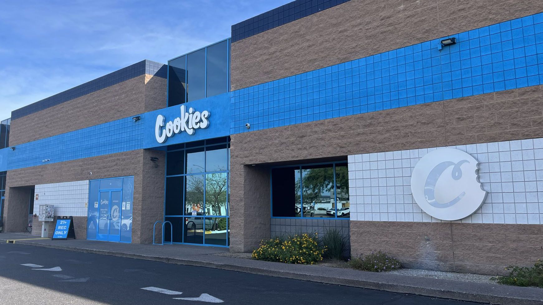
In the highly visual and brand-driven world of cannabis retail, dispensaries are embracing modern design elements that go beyond flower jars and security doors. One standout feature? Digital menu boards. When integrated properly, these dynamic displays do more than share product info—they become a visual extension of the store’s identity.
Whether you’re going for a sleek, minimalist vibe or a lush, boutique atmosphere, here are expert-backed design tips for blending your menu boards with the rest of your store’s aesthetic.
1. Start with Brand Consistency
Your brand colors, fonts, and voice should extend to your menu boards. This ensures a cohesive experience across every customer touchpoint. For example, if your store branding leans toward earthy, organic tones, your menus should reflect that with complementary palettes and clean, natural visuals.
Platforms like GreenScreens and Enlighten allow customization of fonts, layouts, and backgrounds to keep your branding tight across screens and signage.
2. Match Materials and Fixtures
The physical housing of your menu boards—frames, mounts, and stands—should blend in with the textures and finishes of your store’s interior. If your dispensary features wood accents or industrial pipe shelving, consider mounting screens within reclaimed wood frames or matte black brackets for seamless integration.
Solutions from companies like Clover or NoviSign offer flexible hardware setups that can be tailored to your store design.
3. Strategic Placement for Flow and Function
Menu boards shouldn’t disrupt your store’s visual flow. Place them in areas where they can complement architectural features, like behind the counter, near entryways, or adjacent to product displays. Avoid high-traffic pinch points or overly dominant positioning that throws off your aesthetic balance.
Pro tip: Use vertical screens in narrow wall sections or portrait orientation to fit better within your store’s natural layout.
4. Use Ambient Lighting to Your Advantage
Lighting is everything. Too much glare can make a screen unreadable; too little, and it disappears into the background. Use backlighting, spotlighting, or ambient LEDs to illuminate menu boards without overpowering other design elements.
Many dispensaries are incorporating LED light strips behind or beneath menu board frames to create a soft glow that highlights the screen while reinforcing the store’s mood.
5. Curate the Content to Match the Mood
If your dispensary is designed to feel luxurious and calm, like a spa, your menu transitions should be smooth, slow, and minimalist. On the flip side, urban or upbeat shops might use brighter animations or flashier product promos.
Some platforms, like Seed Technology, allow you to schedule rotating visuals that match different moods throughout the day—creating a living, breathing menu experience.
6. Incorporate Artistic or Interactive Touches
To further integrate your menu boards into your aesthetic, wrap them with wall murals, incorporate them into interactive stations, or use touchscreen models to let customers explore.
Brands like budboard and TOAST offer touchscreen options that feel more like a lifestyle kiosk than a typical POS screen, adding depth to the customer journey.
Final Thoughts
When well-designed, menu boards aren’t just functional—they’re aesthetic assets. They can elevate the visual appeal of your store, guide customers, and reflect your brand’s unique vibe. The key is cohesion: if your boards look like an afterthought, your customers will notice. But if they’re designed with intention, they’ll blend in beautifully—and stand out for all the right reasons.

